Back to work
Brand & UX/UIResearch2023

The Global Beauty Agenda

Building a brand identity and website from zero for a beauty‑industry platform serving two very different audiences — every major decision traced back to a research finding, not a preference.

RoleSole UX/UI Designer & Researcher
TimelineFeb – Sep 2023 (8 months)
TypeIndependent project, real client
ToolsFigma, Adobe XD, Illustrator
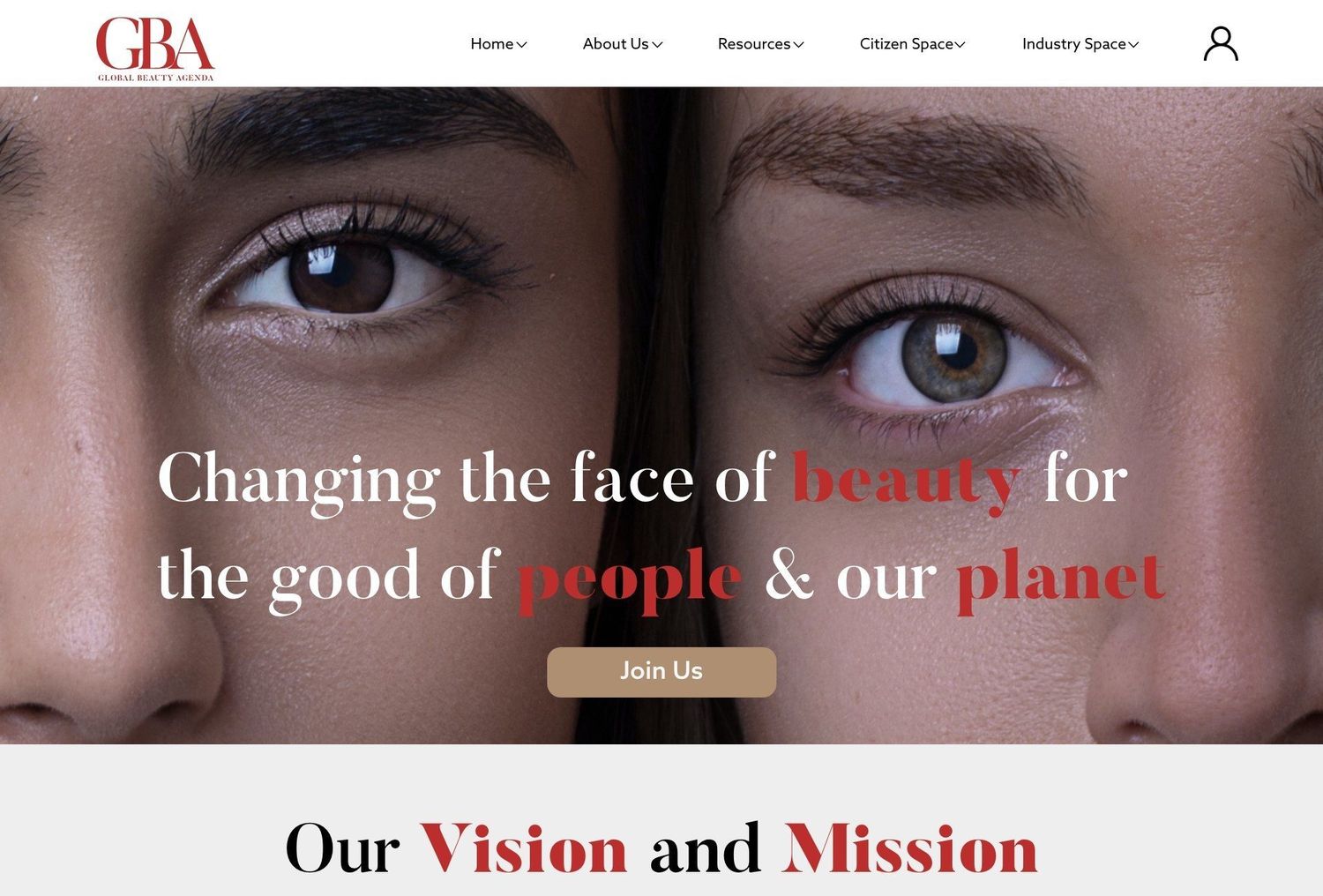
The Global Beauty Agenda homepage — a full-width portrait photograph with the headline Changing the face of beauty for the good of people and our planet
Overview

One platform, two audiences — industry and consumer.

The Global Beauty Agenda (GBA) operates at the intersection of the beauty industry’s business side — memberships, summits, policy work — and its public‑facing side: publications, events, and a general audience that cares what actually goes into their beauty products. GBA came to this project with a name and a mission, but no visual identity and no website. I was brought on to design both from the ground up, and to base every major decision in actual user research rather than personal taste.

Research

Every major decision traces back to a finding.

A 22‑item survey (20 respondents) and four semi‑structured interviews with UX designers, a photographer/illustrator, and a brand‑owning design professor — backed by a literature review on typography, colour and logo design.

85%Linked typography directly to how engaged they felt with a brand
65%Named colour scheme the single most attractive element of a website
70%Rated appealing visuals the top driver of a good website experience
Users

Two personas, not one blended average.

Lydia

Citizen persona · 28, IT professional, London
Needs

Conscious of what’s in the products she buys, but sceptical of brands that only say the right things — needs a platform that reads as credible, not performative.
Andam Cosmetics

Industry persona · London cosmetics brand
Needs

Evaluating whether GBA is worth partnering with — needs to see rigour and industry credibility before engaging.

Process

From deliberately ugly wireframes to a Gestalt‑driven layout.

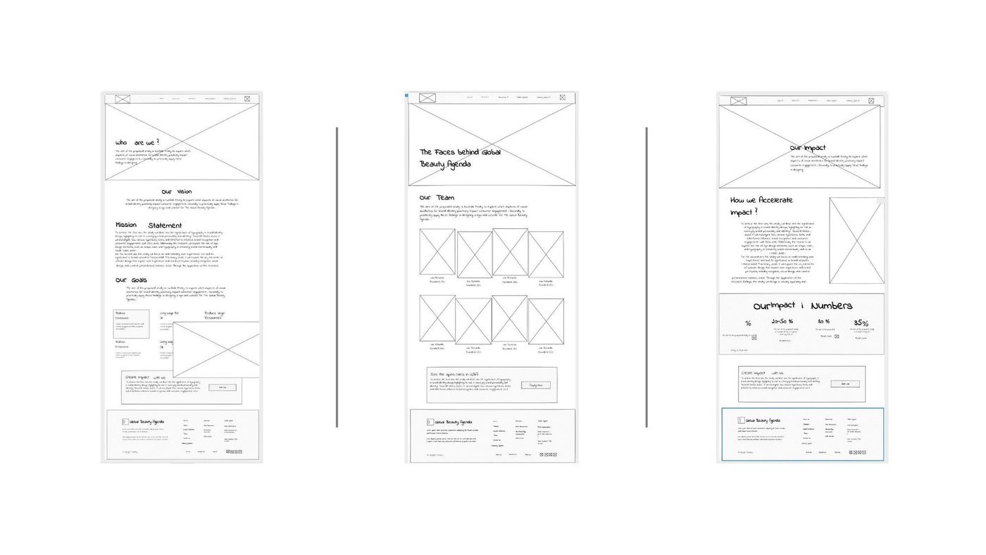
Colour took the longest to settle. I started in greyscale to prototype layout without bias, moved through a navy‑heavy pass that read too corporate, and landed on an editorial red as the primary accent — the colour that tested best for capturing attention without reading as aggressive. Wireframes started deliberately ugly, grey boxes and placeholder type, so layout and hierarchy decisions weren’t propped up by nice photography.

Three low-fidelity greyscale wireframes for the Global Beauty Agenda site, using placeholder boxes instead of imagery
Low‑fidelity wireframes — structure and hierarchy tested before any photography or colour.
Final design

Seven pages, one system, two clearly separated audiences.

Citizen Space and Industry Space are separate top‑level sections rather than a shared page with filters — a consumer never has to wade through membership‑tier language to find a resource, and a prospective partner never has to scroll past subscribe forms to find credentials.

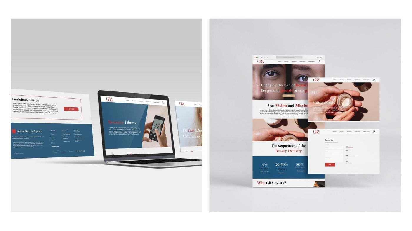
The finished Global Beauty Agenda site shown across a laptop and several browser mockups, including the homepage, Citizen Space and Contact page
The final system across devices — Home, Citizen Space and Contact.
Honest outcome

Research‑informed design, not a performance dashboard.

This was an independent project delivered with a real client brief, not a shipped product with analytics behind it — there’s no A/B test or conversion data to point to. What I have is research‑informed design: every major decision traces back to a specific finding from the survey, the interviews, or the literature. What I’d change next time: the interview sample skewed toward people with design backgrounds, which narrowed how representative it is of GBA’s actual mixed audience — a larger, less design‑literate sample would stress‑test the conclusions harder.

This is the short version.

The full write‑up is a 17‑page PDF covering empathy maps, the logo evolution, colour testing and every final page in detail.

Read the full case study (PDF)