Designing patient‑flow software for the clinics enterprise EMRs ignore
A feature brief for a 2–5 doctor clinic — check‑in queue, rooms, doctor availability, wait times, insurance status — turned into a working prototype in one sitting. As much design effort went into what to leave out as what to build.
A note on how this was built
A real feature brief, turned into a working prototype in one session
I set myself a product brief in the format a stakeholder might actually hand a designer: a feature list to include, and — just as important — a list of things to explicitly leave out. Nothing here comes from a real clinic engagement or client data; there's no clinician feedback and no usage numbers, and I say so plainly in the outcome section below. What I can stand behind is the design judgment: turning seven bullet points into a coherent system, and holding the scope line against real pressure to just build everything asked for. I used an AI‑assisted build workflow (Claude Code) to get from spec to a real, clickable prototype in one sitting rather than static comps — the scoping, the interaction model, and every decision below were mine to make and defend.
UX Methods Applied
The techniques behind each section below
Compressed into one sitting or not, this followed the same sequence I'd use on a paid engagement — research before personas, personas before structure, structure before pixels. Each one below maps to a section further down this page.
The Brief
What to build, and — deliberately — what not to
The brief was for an internal tool for medical clinics running 2–5 doctors, focused on patient flow rather than clinical record‑keeping.
To include
Explicitly not in scope
User Research
Desk research, not fabricated interviews
Why This Gap Exists
Too small for enterprise software, too complex for a whiteboard
A 2–5 doctor clinic sits in an awkward middle. Enterprise practice‑management and EMR suites are built — and priced — for hospital systems and large multi‑site practices; adopting one for a five‑doctor clinic means paying for, configuring, and training staff on modules nobody there will ever touch. The alternative most small clinics actually run on is a paper sign‑in sheet, a dry‑erase board for rooms, and word‑of‑mouth down the hallway for "Dr. Whitfield's running behind." That works until the waiting room has six people in it and the receptionist has no way to know which room is really ready.
The design opportunity wasn't "build a smaller EMR." It was to build the one layer a small clinic is actually missing — operational visibility — without dragging in everything an EMR already owns.
User Personas
Three jobs, three different screens
Built from the research findings above, not from thin air. Each one is who a specific screen had to work for — if a decision didn't serve one of these three, it was probably scope creep.
Goals
- Keep the queue moving without double‑booking a room
- Give patients an honest wait estimate without guessing
- Get through insurance checks without falling behind on check‑ins
Frustrations
- Insurance verification eats her morning — the single biggest recurring time drain
- No shared source of truth for which room is actually ready
- Answering "how much longer" a dozen times with no real number to give
8:52am, two patients checked in back‑to‑back, one on hold about a referral, and Dr. Whitfield just told her — verbally, in passing — that he's running late. She needs that fact visible to everyone in the next ten seconds, not remembered correctly by her for the rest of the morning.
Goals
- Know if he's fallen behind before a patient has to tell him
- Flag his own lateness once, not explain it room by room
- Get in and out of a status check without breaking visit flow
Frustrations
- Has to guess whether the front desk already knows he's behind
- No patience for logging into a full EMR just to check a queue
- Glancing at a phone between rooms is the only real "checking in" moment he has
Between patients, phone in hand for maybe four seconds — long enough to see his own status, not to navigate. If marking himself "Running Late" takes more than one tap, he won't do it, and the whole point of the alert system quietly breaks.
Goals
- Spot a bottleneck — a late doctor, a stuck room — before it cascades
- Watch insurance‑issue flags before they become a billing problem next week
- Answer "how's today going" without interrupting three people to ask
Frustrations
- Today's actual state lives in people's heads, not anywhere she can see it
- Finds out about problems from a frustrated patient, not from her own systems
- Has to context‑switch into whoever's role she's covering, cold
Steps away from her desk for twenty minutes and comes back to a waiting room that feels tenser than when she left. She needs one screen that tells her why in five seconds, not a walk around the clinic to ask.
Scope Decisions
Why it stops exactly where it stops
Information Architecture
Five siblings, one level deep, on purpose
The seven‑item brief could have become a deep, nested app — settings inside settings, a room detail page inside a room list page. Instead it's flat: five sibling views behind one persistent nav, plus two things that are deliberately not pages — the check‑in action and the alert surface, because neither one is a place you go, they're things you do or see from wherever you already are.
The flat structure isn't a default, it's a decision, checked against three things: Miller's Law (five nav items sits comfortably inside the "5±2" working‑memory range a stressed receptionist can hold), Hick's Law (fewer top‑level choices means faster navigation decisions under time pressure), and Jakob's Law (a persistent left sidebar plus a top bar is a pattern clinic staff have almost certainly used in other software already — this wasn't the place to be original).
Each view also takes a URL query param (?view=queue), so a manager can text a direct link to a screen instead of saying "click Rooms, then—"
Wireframes — Low to Mid Fidelity
Structure before style, twice
Two passes before any visual design was allowed to happen. Low‑fidelity blocked out where content lives and roughly how much of it there is — no real copy, no component detail, cheap to throw away. Mid‑fidelity resolved real labels, actual column proportions, and component shapes, and is where status "chips" first appear — as plain outlines, to test whether shape and text alone would be legible before colour was ever added in the final build.
① stat cards ② running‑late banner ③ queue list ④ room grid ⑤ doctor list — labelled purely to lock down where things live, before any of them had real content.
Real copy, real column widths, real component shapes — still no colour. This is the pass that caught the queue table's column‑width problem before it ever reached code.
Rooms, Doctors, and Patient Lookup went through the same two passes; they're not all reproduced here for space, but the same rule held everywhere — nothing moved to code until its mid‑fidelity pass matched what the persona using it actually needed first.
The System, Screen by Screen
Five views, one shared state underneath
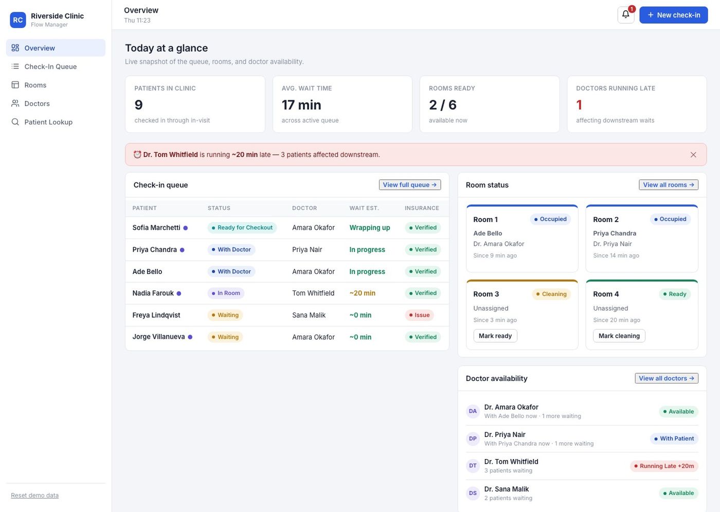
Every screen reads and writes the same underlying patient, room, and doctor records — nothing here is a static mock standing next to another static mock. Assigning a room in the queue immediately updates the room board; a doctor marked running late immediately recalculates every affected patient's wait estimate.
Overview — the glance screen
Stat cards, a running‑late banner naming the doctor and exactly how many patients it affects, the top of the queue, room status, and doctor availability — all visible without a click. Built for someone mid‑phone‑call, not someone with two free minutes to navigate.
Check‑in queue — status‑driven, not free‑text
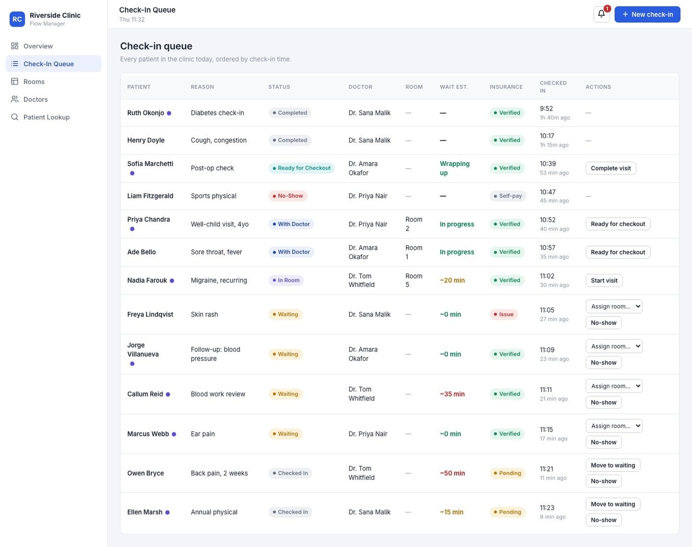
Every patient is in exactly one of six states — Checked In, Waiting, In Room, With Doctor, Ready for Checkout, Completed — and the action buttons in the row change with the state. A patient who's already with a doctor can't be "assigned a room" again; there's no button for a state they're not in. Wait‑time estimates are colour‑coded so a receptionist scans severity, not numbers.
Room status board — auto‑routes on checkout
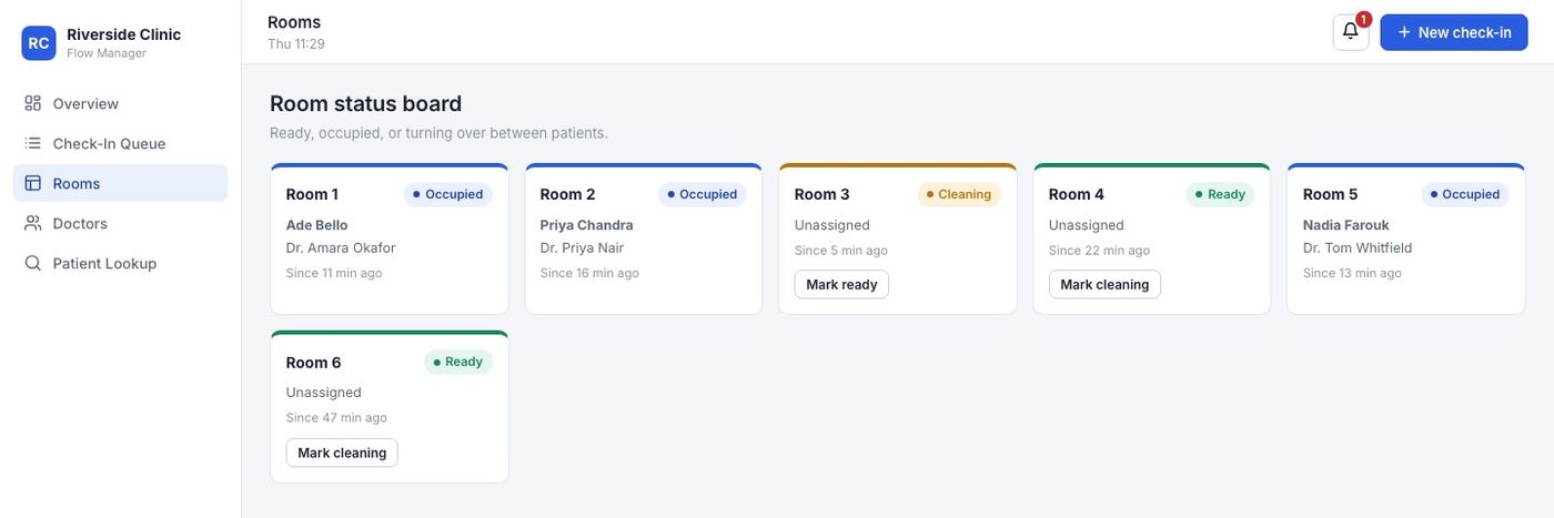
Completing a visit doesn't send a room back to "Ready" — it sends it to "Cleaning," because a room isn't actually ready until someone on staff says so. That one rule (checkout → cleaning, never checkout → ready) was the single most important modeling decision in the whole board.
Doctor availability — status is a control, not just a display
Marking a doctor "Running Late" exposes a minutes input right there on the card — no separate settings screen — and that number immediately propagates into every affected patient's wait estimate and into the Overview alert banner. It's a single source of truth for lateness, not three places to keep in sync by hand.

Patient lookup — deliberately shallow
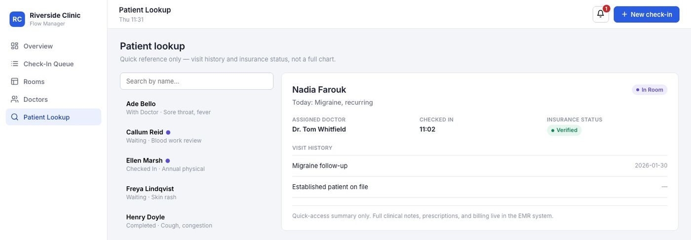
This is the screen most tempting to over‑build. It shows today's reason for visit, the assigned doctor, insurance status, and — for returning patients — the last visit's date and reason. Nothing clinical, nothing structured as a chart, and a visible line at the bottom saying so. The constraint here was as much about what the screen refuses to become as what it shows.
New check‑in — the one form in the whole tool
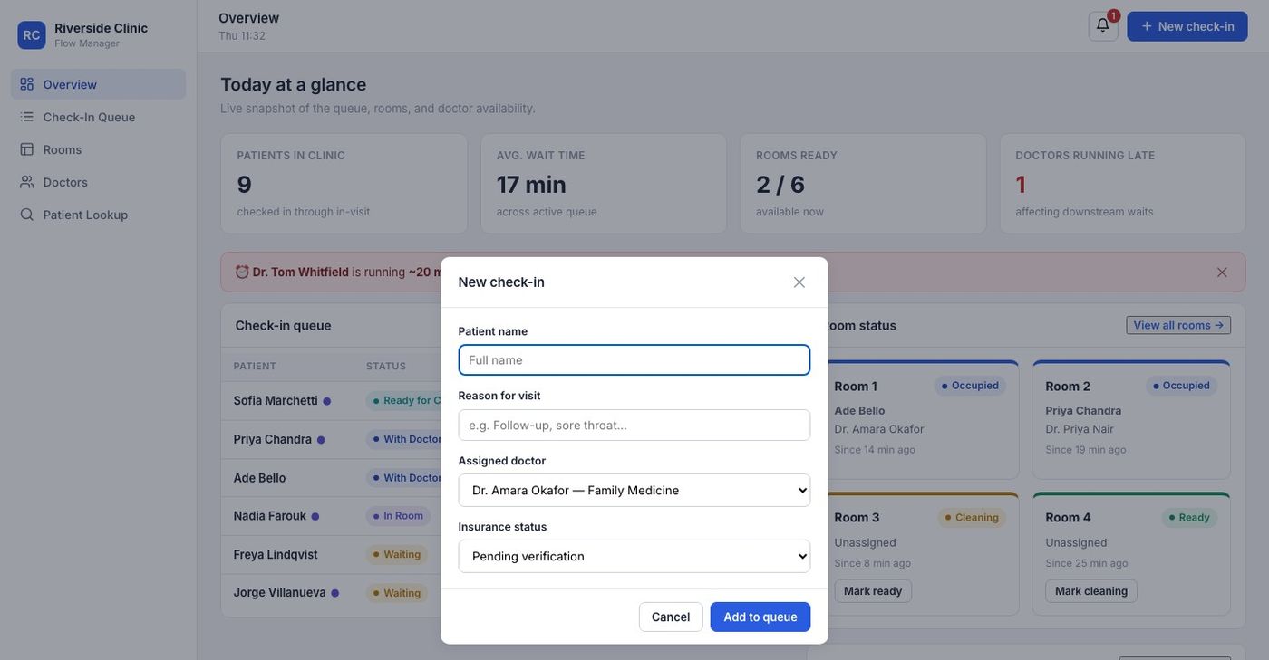
Name, reason, assigned doctor, insurance status — four fields, because every field beyond that is something the brief put out of scope (no address, no DOB capture, no insurance ID entry). A short form was itself a scope decision, not just a UI one.
The Wait‑Time Model
A transparent heuristic, not a black‑box prediction
Rather than inventing a false sense of precision, the estimate is a simple, inspectable calculation: how many patients are ahead of this one for the same doctor, multiplied by an average consult length, plus that doctor's current lateness.
Colour thresholds turn that number into a scan‑able signal rather than a number to read: green under 15 minutes, amber 15–30, red 30 and over. It's honest about being a heuristic — there's no claim of statistical prediction here, and the average‑consult constant is a placeholder a real clinic would need to calibrate against its own specialties.
Honest Limitations
What's simulated, and what I'd want before trusting this with a real queue
Every interaction in this prototype works for real — status transitions, room assignment, alerts — but none of it has been run against an actual clinic's operations. Specifically, here's what I haven't validated:
- The 15‑minute average consult assumption is a single flat constant. A pediatrics well‑visit and an internal‑medicine follow‑up don't take the same time, and the model doesn't yet know that.
- Five views vs. one dense screen is my judgment call, not a tested one. A very small clinic (2 doctors) might find the split unnecessary; I'd want to watch actual front‑desk staff navigate it before deciding.
- Insurance verification is a manual status flag, not an eligibility‑check integration. Real insurance verification would involve a payer API and a genuinely different, more complex flow.
- No accessibility audit yet — colour is used to reinforce status (with text labels alongside, not colour alone), but I haven't run a full WCAG pass or tested with a screen reader.
- No multi‑user or concurrency model. State lives in a single browser's local storage; a real deployment needs a shared backend the moment a second front‑desk terminal exists.
Reflection
The brief's "not in scope" list did more design work than the feature list
The instinct with a seven‑item feature brief is to start designing the features. The more useful discipline turned out to be designing against the four‑item exclusion list just as hard — because "no EMR" isn't self‑enforcing once you're deep in a patient‑history screen and it would be so easy to add one more clinical field. Holding that line, and modeling the patient journey as a fixed lifecycle instead of a flexible free‑text status, is what turned seven disconnected features into one system instead of seven small tools sharing a sidebar.
That’s the long version.
Prefer the summary? The short version covers the same story in about two minutes.