Designing patient‑flow software for the clinics enterprise EMRs ignore
A feature brief for a 2–5 doctor clinic — check‑in queue, rooms, doctor availability, wait times, insurance status — turned into a working prototype in one sitting. As much design effort went into what to leave out as what to build.
A feature list isn’t a product — it’s a checklist waiting to become one.
The brief was a straightforward feature list: check‑in queue, room status board, doctor availability, wait‑time predictions, patient history quick‑access, insurance verification tracking, running‑late alerts — built for a small clinic running 2–5 doctors. Just as deliberate was what it explicitly ruled out: no full EMR, no prescriptions, no billing, no telehealth. My job wasn’t to tick seven boxes — it was to turn that list into one coherent system a front‑desk person could actually run a clinic from, and to hold the scope line on everything the brief said this tool is not.
Too small for enterprise software, too complex for a whiteboard.
A 2–5 doctor clinic doesn’t have the budget or the staff for an enterprise practice‑management suite built for hospital systems — but a paper sign‑in sheet and a dry‑erase board can’t tell you which room is actually ready, how late a doctor is running, or what that means for the six people already waiting. This prototype is scoped for exactly that gap.
Scope the system before designing a single screen.
Scope
Mapped the 7‑item brief to 5 views by who actually uses each one, and drew a hard line at EMR, billing and telehealth before designing anything.
Model
Designed the patient journey as a fixed lifecycle — six statuses, not a free‑text field — so every action on screen is contextual to where that patient actually is.
Build
Built it as a real, clickable prototype rather than static screens, so room assignment, status changes and late‑doctor alerts could be tested as interactions.
Reflect
Flagged, explicitly, what’s simulated versus what would need real front‑desk input before this could be trusted with an actual queue.
One screen answering “what’s the state of the clinic right now?”
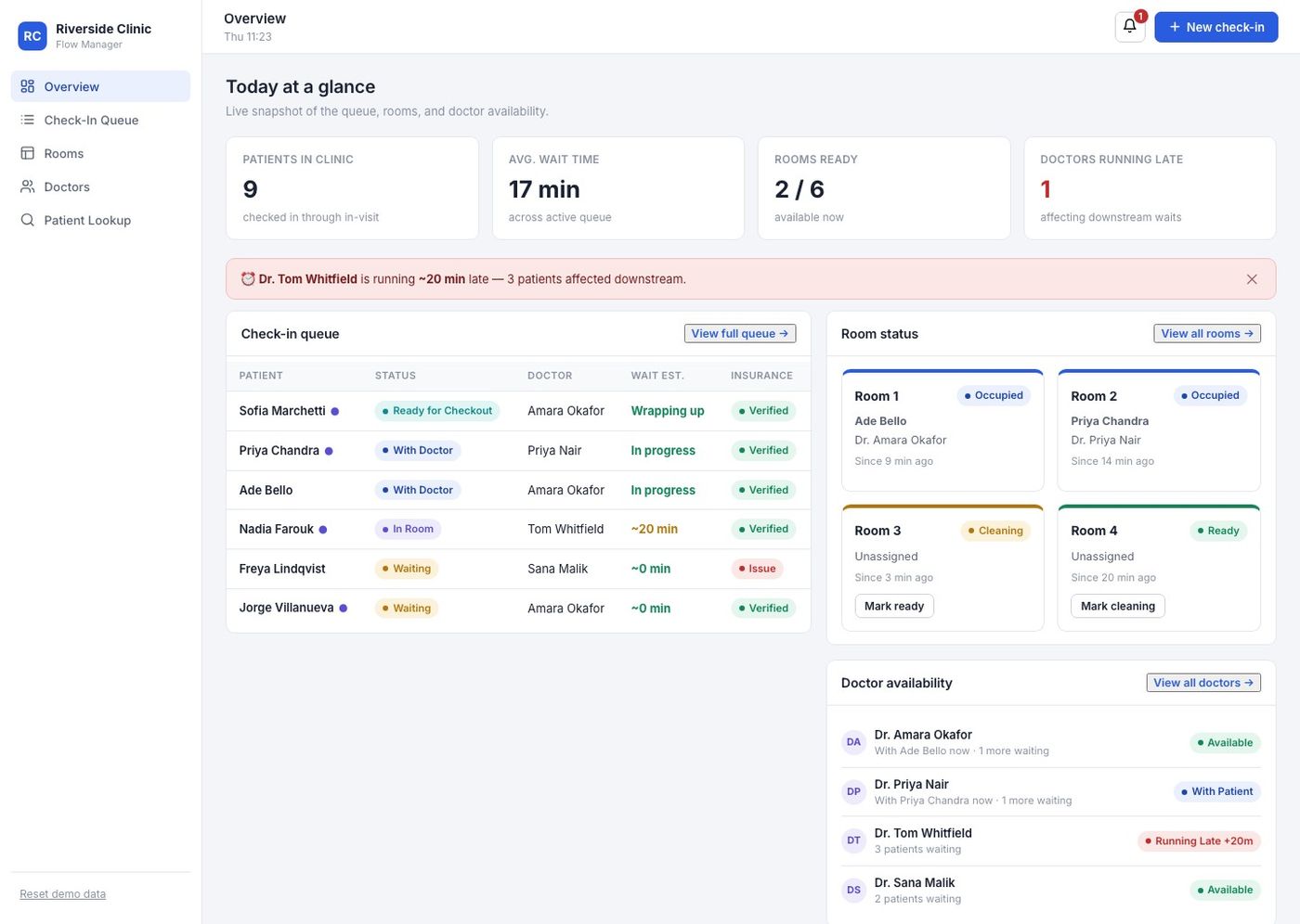
The Overview dashboard exists because no single other screen should have to. Stat cards, a running‑late banner, the top of the queue, room status and doctor availability — all visible without a click, because a receptionist mid‑phone‑call doesn’t have time to navigate.
Every status change routes through the same underlying state.
Assigning a room in the queue updates the room board. Completing a visit frees the room straight to “Cleaning”, not back to “Ready” — because a room isn’t actually ready until someone says so. Nothing here is two disconnected screens that happen to sit in the same app.
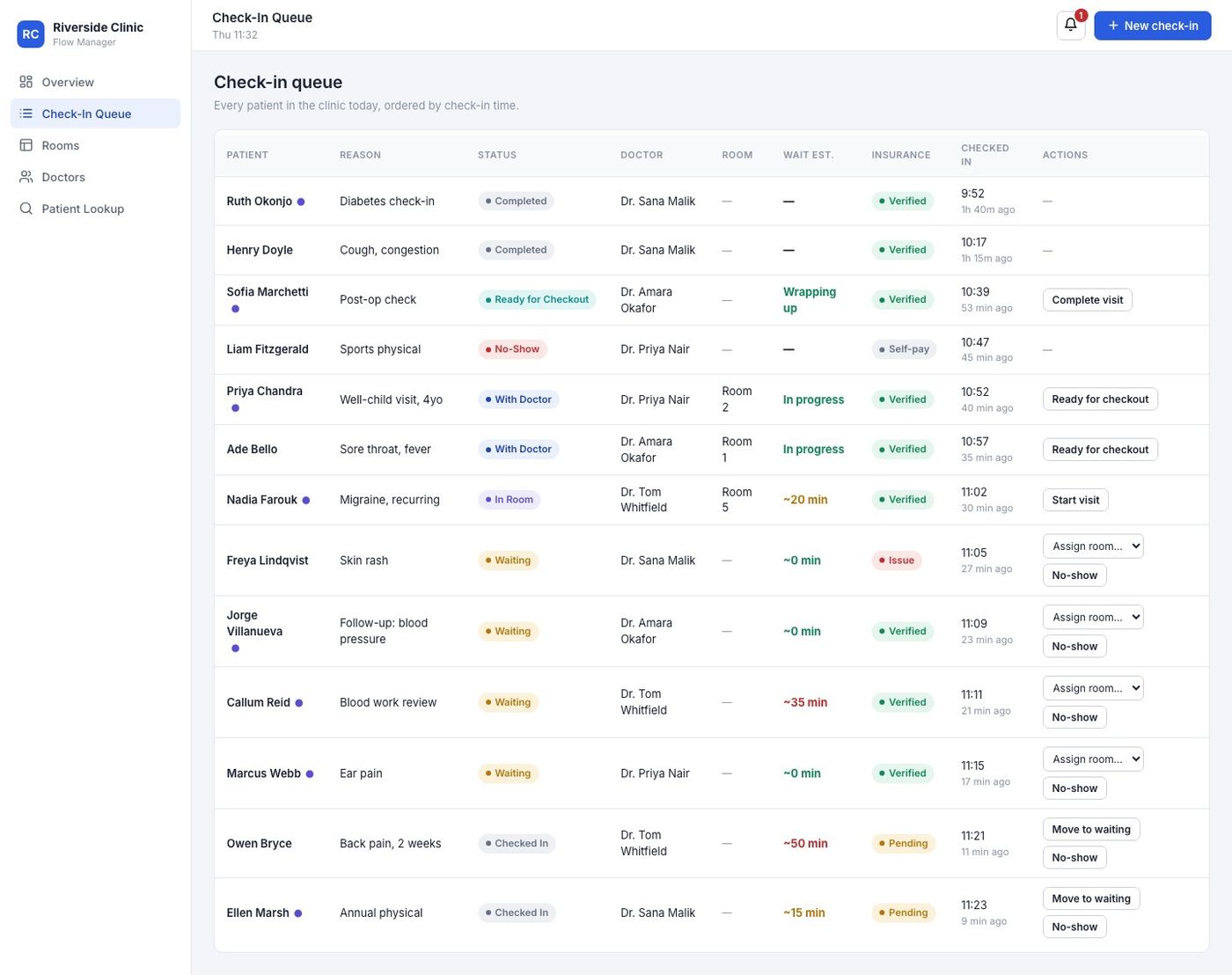
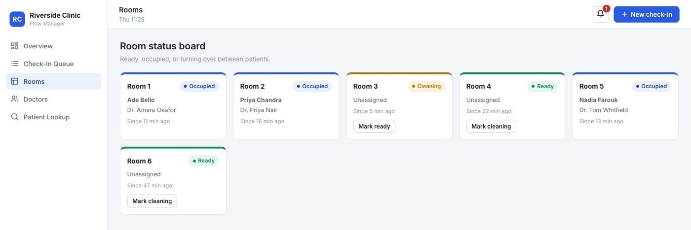
Check‑in queue and room status board — status‑specific actions only, no dead buttons for a state a patient isn’t in.
A working concept — not a claim that it’s been run in a real clinic.
This was built and tested end‑to‑end in a single session: every status transition, room assignment and alert works as a real interaction, not a static mock. What it hasn’t had is a single hour of use by an actual front‑desk team, so I’m not going to present it as validated. The wait‑time model, the five‑view split and the insurance‑status flow are all my best design judgement against the brief — not something I’ve watched a receptionist use under real pressure yet.
This is the short version.
The full write‑up covers the desk research behind it, three role‑based personas, the information architecture, the wireframes, the wait‑time model and every screen.