Turning fragmented career information into a system 800+ students could actually read
Eight department career boards, designed from nothing, at Ark Acton Academy — where the real problem wasn’t the artwork, it was turning inconsistent, unstructured input from eight department heads into something a teenager would stop and read in a hallway.
Career knowledge existed. A system for delivering it didn’t.
Ark Acton Academy already ran a formal careers programme — it’s a stated part of how the school supports students into their next steps. What it didn’t have was any shared visual or informational system for delivering that inside the building. Career knowledge existed, but only in the form each department head happened to hold it in: a paragraph in an email, a five‑minute hallway conversation, a half‑remembered list of job titles.
I was asked to design a career board for each department — one per subject — to go up on the walls outside each department’s classrooms. The brief was simple: get students to actually engage with career information instead of walking past it. The hard part wasn’t the visual design. It was that I was the only person turning eight inconsistent, informally‑delivered inputs into something that had to work as one legible system, at a school of 800+ students who’d see it in passing, not sit down and study it.
What this actually was — and what a fuller process would have added.
I want to be precise rather than dress this up as a research process it wasn’t. There was no formal usability testing and no structured research plan going in — I was doing design and print production for a school, not running a UX research function. What did happen, before and after the boards went up, maps onto real methods even though I wasn’t naming them that way at the time.
Informal stakeholder consultation
Content came from unstructured conversations with 8 HODs — closer to informal input‑gathering than a structured interview process. No discussion guide, no consistent format between subjects.
A lightweight intake brief
A short structured template per HOD (career clusters, 2 spotlight roles, a “why this subject” line) would have made 8 wildly inconsistent inputs comparable from the start, instead of me reconstructing structure after the fact.
Naturalistic observation
After boards went up, I watched — unplanned, not instrumented — and saw students stop and look. Real, but anecdotal: no count, no comparison to before, no way to isolate cause.
A short guerrilla test before print
Five students, thirty seconds each, on a printed draft: what do you remember, what would you do next. Would have told me whether “if you like analysing…” actually worked as a sorting logic before it went on a wall for a term.
Follow‑up interviews with HODs
After the boards had been up a while, I went back to each HOD and asked how students were engaging, what questions came up, which pathways drew the most interest, and how the board’s positioning was working. Informal, unstructured, but real — and it directly shaped what happened next.
Talk to students directly, not just HODs
Everything about student reaction came secondhand, through HODs. Going straight to a handful of students would remove a layer of interpretation and probably surface things HODs didn’t think to mention.
Judgement‑based content grouping
I grouped each subject’s careers into thematic clusters by hand — by interest type, by geography, by process stage — rather than listing roles flat. This was designer intuition, not a validated exercise.
A quick card sort with students
Handing 15–20 role cards to a handful of students and asking them to group them would show whether my categories actually match how students think, rather than how I think a subject breaks down.
A measurement loop
Some lightweight way to track engagement after the fact — even something simple — would turn “I think students engaged with this” into an answerable question.
Eight visual concepts, one shared content logic.
Every board looked different — that was deliberate, not an inconsistency. Each subject got its own visual concept built around what that subject actually is:
- Science — a branching tree, careers growing out from the subject like roots and branches
- French — a world map, tracing where the language actually takes you
- Humanities — framed as big open questions, since the board covers History & Politics, Geography, RE, and PSHE & Social Sciences together
- Maths — a central hub with six spokes, “maths is behind more jobs than you think”
- Business — a wheel of five sectors under “many careers, one subject”
- Art — a career pathway from idea to finished creative work, credited to Nelson Dai, Head of Art & Design, whose subject expertise shaped the content
- Music & Drama — one shared board covering performance, production, and industry roles
- English — organised by interest type rather than job ladder (see below)
What ties the eight together isn’t a single rigid template — it’s a shared logic. Every board opens with a title that reframes the subject as a gateway rather than a topic (“Where can French take you?”), then breaks careers into thematic clusters rather than a flat list, with a “key skills” tag attached to each cluster. Three boards — English, French and Humanities — go a step further, each pulling out one or two specific “Career Spotlight” roles with real detail and a one‑line reason the subject matters to that job. The other five don’t have that layer; I’m not going to claim they do.
The English board — sorting by self‑recognition, not job titles.
“Where Can English Take You?” organised careers by how a student might already think of themselves, not by job title: if you like analysing, if you like speaking, if you like working with ideas, if you like writing. Each quadrant held career icons, and two pulled‑out “Career Spotlight” call‑outs with real detail — a Journalist and a Script Editor under Writing, a Translator and a Communications Manager under Working With Ideas — each closed out with a one‑line reason the subject actually matters to that job.
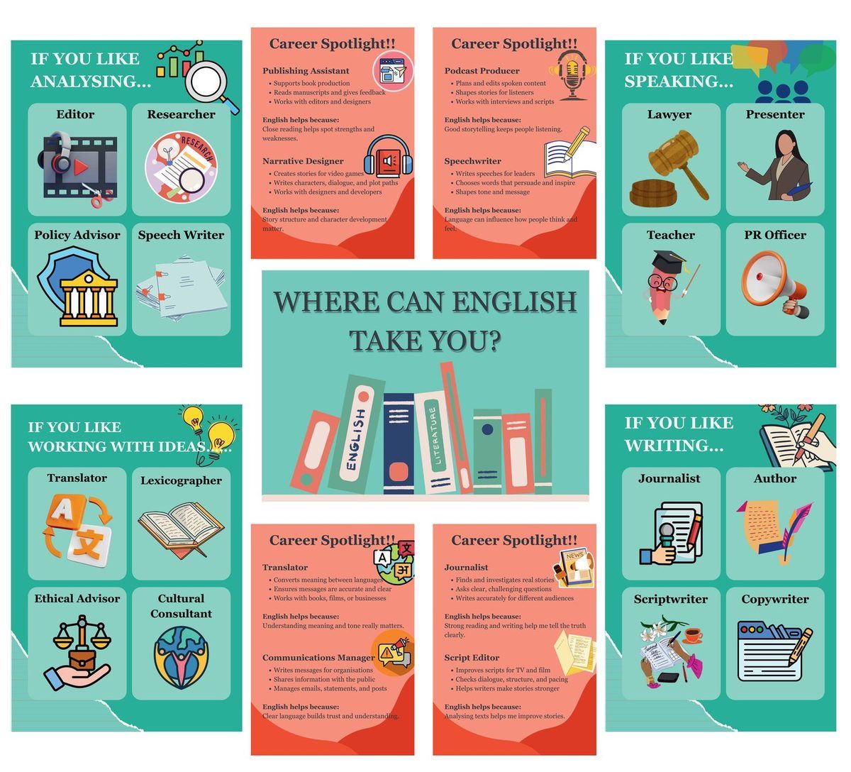
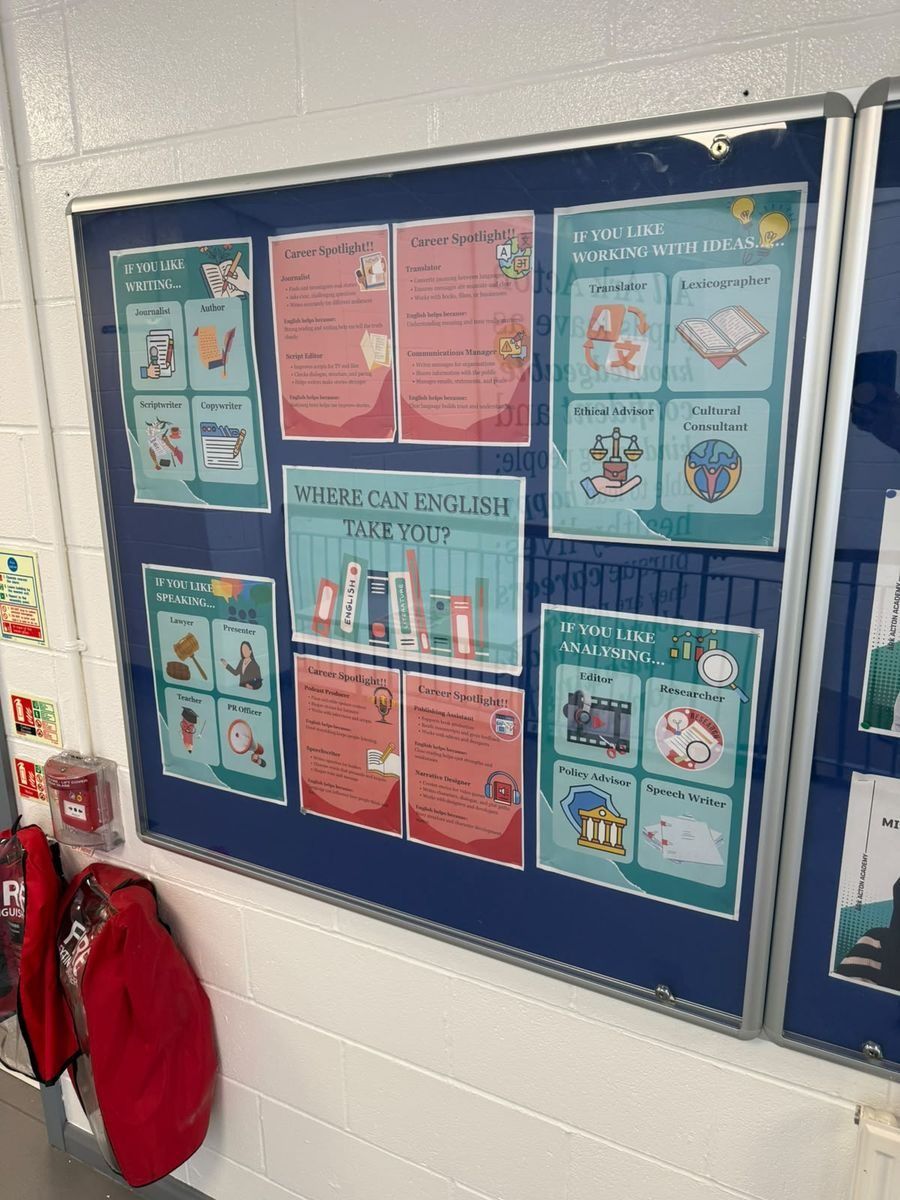
Organising by interest (“if you like…”) instead of by career ladder was the one deliberate structural choice I’d point to if asked to defend a decision: a 14‑year‑old browsing for ten seconds doesn’t know they want to be a “Speechwriter”, but they might know they like speaking. Sorting by self‑recognition rather than job taxonomy is what made the spotlight roles land instead of getting skipped.
All eight, as they actually went up.
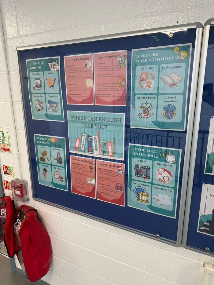
English
Interest‑based quadrants
Has Career Spotlight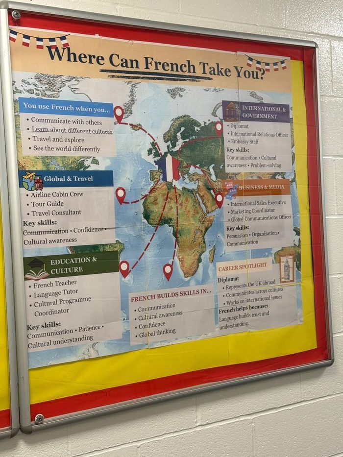
French
World map of career destinations
Has Career Spotlight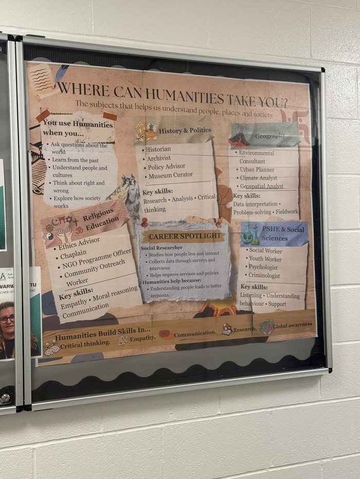
Humanities
Big‑questions framing — History & Politics, Geography, RE, PSHE
Has Career Spotlight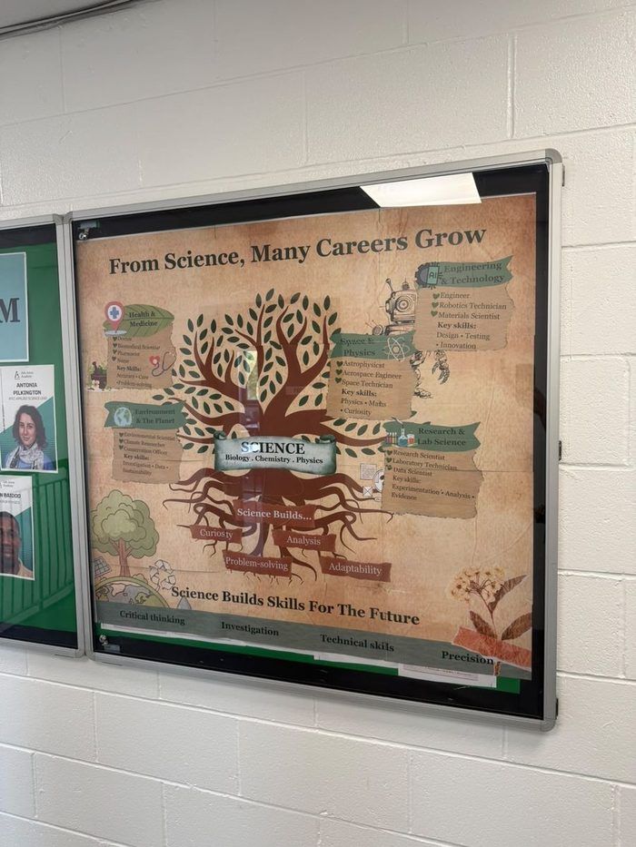
Science
Branching tree of career clusters
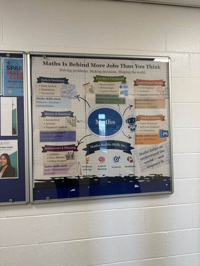
Maths
Central hub, six career spokes
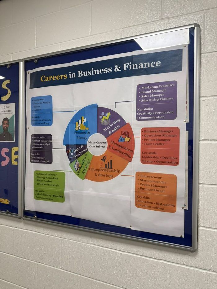
Business
Wheel of five sectors
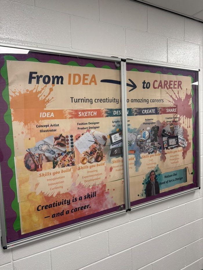
Art
Idea → Sketch → Design → Create → Share pathway
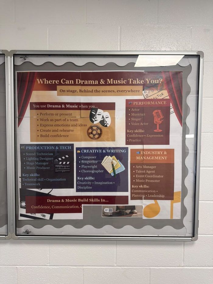
Music & Drama
Performance, production & industry roles
Direct observation and follow‑up conversations — not a metric.
No usage data exists for these boards — there was no way to measure foot traffic, and I want to be upfront about that rather than imply otherwise. What I do have is direct, first‑hand observation, and a real round of follow‑up conversations with HODs after the boards had been up for a while.
I went back to each HOD and asked how students were actually finding the board: what kinds of questions it raised, what students were asking about, which pathways they seemed most drawn to, whether the positioning of the board itself was working, and what else HODs thought could help inform students further. The consistent answer was that noticeably more students were coming to HODs with questions than before — no hard numbers, HODs weren’t counting, but the shift was real enough that several of them mentioned it unprompted.
It went further than that in a few departments. Some HODs used it as the reason to set up dedicated careers workshops, telling students about the session in advance so they’d arrive with questions already in mind rather than starting cold. That turned a static board into the opening move of an actual live exercise — not something I planned from the start, but a real downstream effect of it existing.
The idea also extended past the physical boards: working with HODs, career information — a rotation of different roles, their pathways, and the subjects needed to get there — was added to TrilbyTV, the digital screens already running around the school. That’s a real, shipped extension of the system beyond the department corridors.
That’s the long version.
Prefer the summary? The short version covers the same story in about two minutes.