Turning fragmented career information into a system 800+ students could actually read
Eight department career boards, designed from nothing. The hard part wasn’t the artwork — it was turning inconsistent, unstructured input from eight heads of department into one legible system.
One content logic, eight different visual concepts.
Ark Acton Academy ran a careers programme but had no shared visual system delivering it inside the building — just fragmented input, held differently by each of eight department heads, ranging from an email paragraph to a hallway conversation.
I designed one board per department to fix that: the same underlying content logic on every board — careers grouped into thematic clusters with key skills, not flat lists — but a distinct visual concept per subject, so each board felt intentional rather than templated. Three boards (English, French, Humanities) went further, pulling out specific “Career Spotlight” roles with a one‑line reason the subject matters to that job.
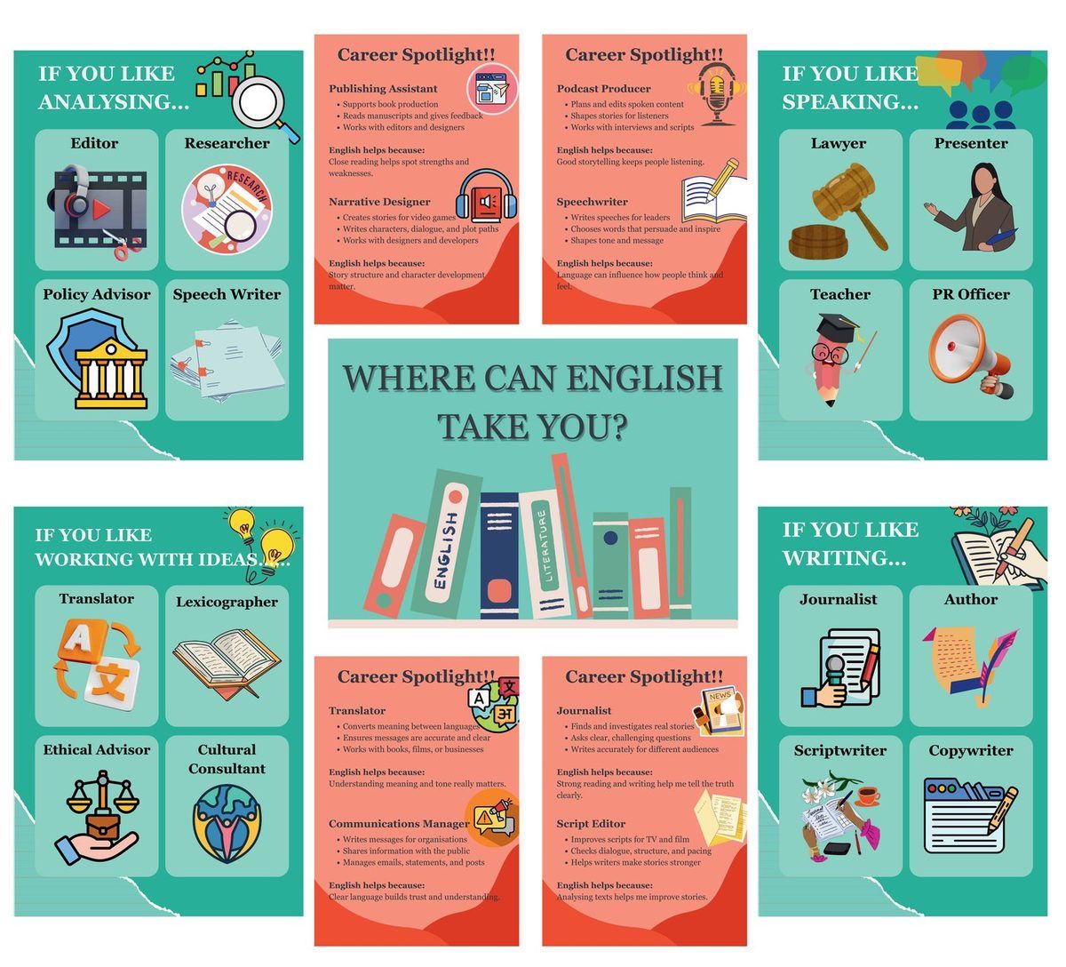
All eight, as they actually went up.
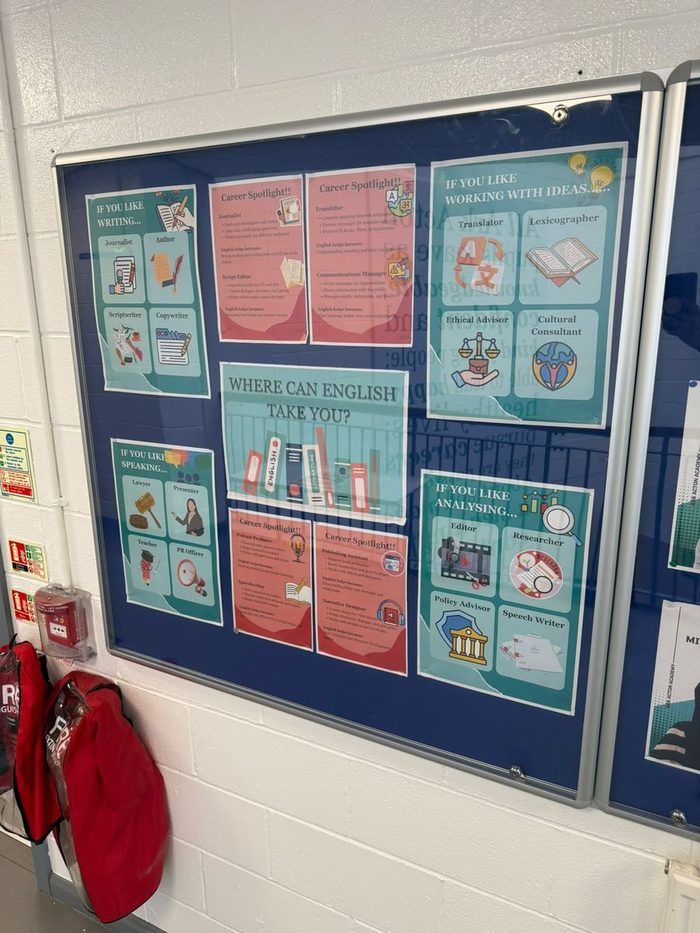
English
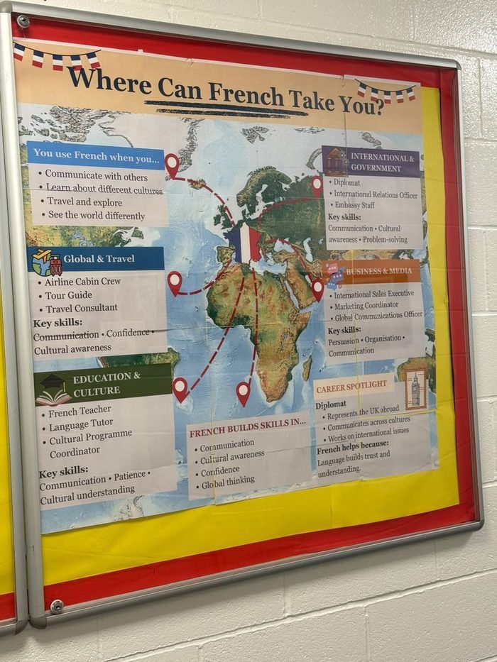
French
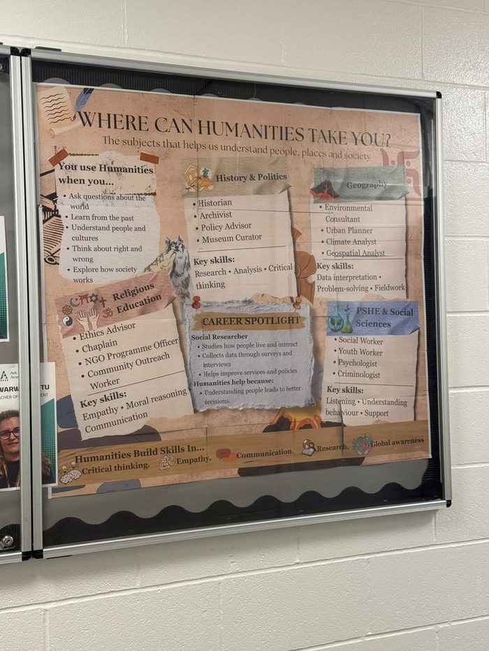
Humanities
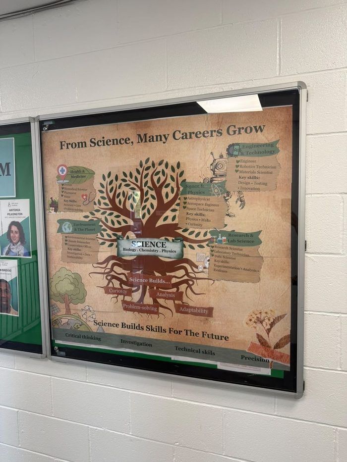
Science
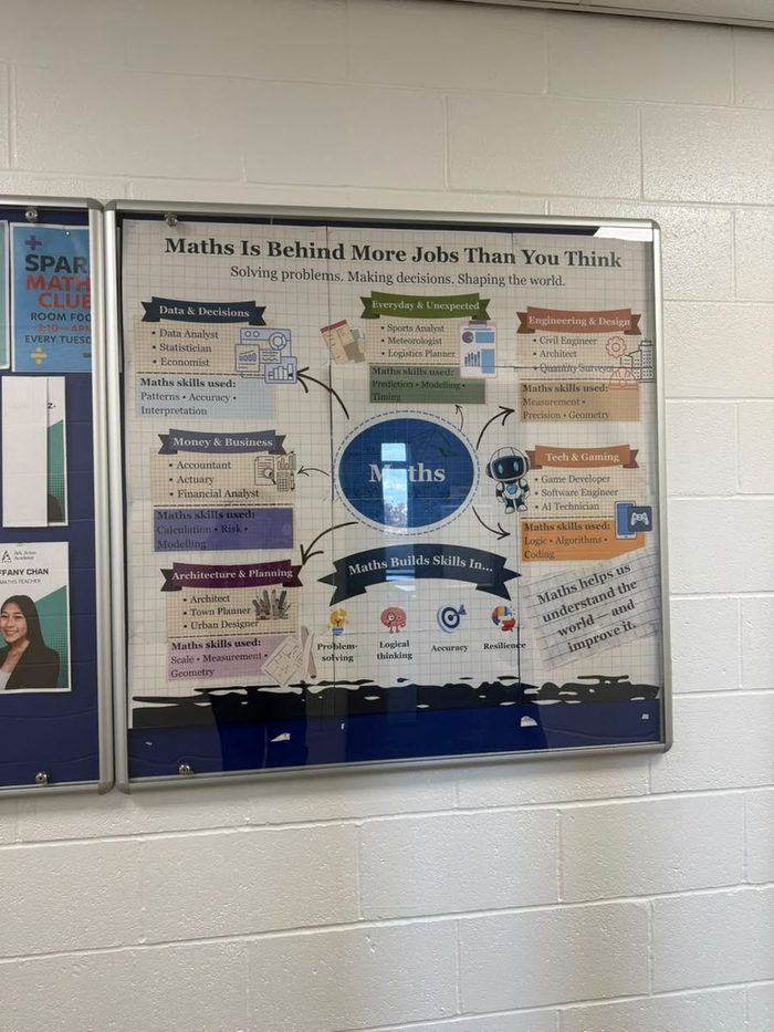
Maths
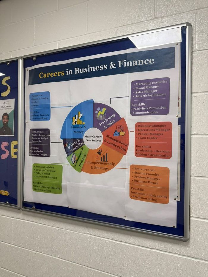
Business
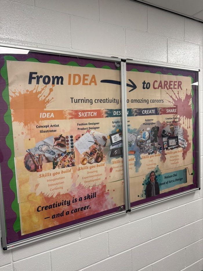
Art
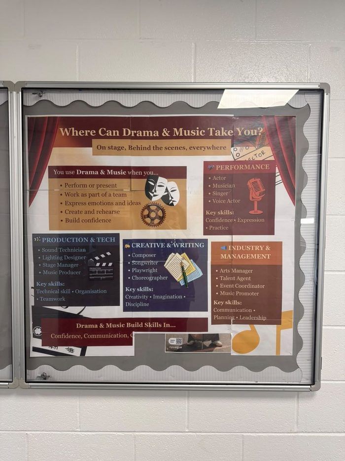
Music & Drama
Real, but qualitative — and I won’t imply otherwise.
No usage data exists — there was no way to measure foot traffic. What’s real: I saw students stop and look, HODs praised the boards unprompted, and in follow‑up interviews I ran afterwards, HODs consistently reported noticeably more students coming to them with questions. No hard numbers, but a repeated, independently‑mentioned observation.
A few HODs went further and set up dedicated careers workshops off the back of it, briefing students in advance so they arrived with questions ready. The idea also extended onto TrilbyTV, the school’s existing digital signage, as a rotating careers segment.
This is the short version.
The full write‑up covers the methods I used and the ones I’d add, the shared content logic behind all eight boards, and the closest look at the English board.